Industry
Non-Profit / Senior Services
Roles & Services
UI Design
Silver Key

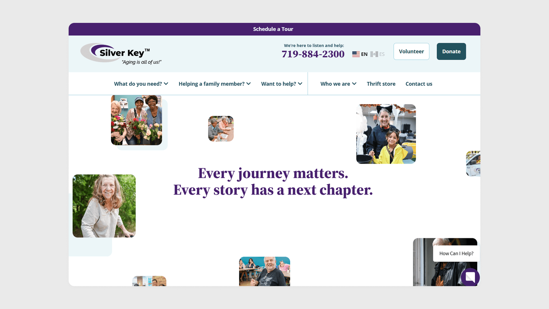
Designing a warm, task-driven digital front door for a senior services nonprofit, helping people find the right kind of help in one click.

Figma

Adobe Photoshop
The Challenge
Silver Key needed a visual system that felt approachable and human for seniors and caregivers, while still reading as credible and polished to donors and partners. The existing site lacked a clear component structure, making the interface feel dense and inconsistent across pages.

Key Problems
The site had no established component system, so pages felt visually inconsistent from one to the next. The interface needed to feel calm and easy to navigate for an older audience without looking dated, and accessibility mattered more than on a typical site.
Project Goals
The goal was to build a component system flexible enough to support the full range of programs and pages, while making the interface feel warm and reassuring through layout, spacing, and imagery treatment. Accessibility needed to meet a higher bar given the primary audience, all while maintaining a polished, credible look for the donor and partner-facing side of the site.
My Role & Approach
Adapting to an In-Progress Project
I was brought into this project after the color palette and style direction had already been agreed on with the client. As the sole designer on the project, I was responsible for translating that direction into the full UI system:
Component System: Designing and building the full UI kit within the established visual language
Accessibility-First Decisions: Prioritizing legible type scale, contrast, and simple interaction patterns suited to an older audience and their caregivers
Responsive Layouts: Adapting the full component system across desktop and mobile
Styleguide & Component Organization
I built the Figma file around a clear, consistent naming system and a dedicated styleguide, section patterns, and components structure, so anyone opening the file could quickly understand how the pieces fit together. Every component followed the same conventions, keeping the file organized and easy to navigate as it grew.

Accessibility & Clean Design
Because the primary audience skews older, I prioritized a clean, uncluttered interface with a larger type scale, strong contrast, and simple, predictable interaction patterns. Every component was designed to be easy to read and navigate at a glance, without sacrificing the polish and credibility the site needed for donors and partners.


Component Library for Scale
With more than ten pages across the site, I built a reusable set of components that worked consistently across all of them. That meant every page, regardless of its content or purpose, shared the same visual language and held together as one cohesive system.
Key Deliverables
Styleguide
Full UI component library
Accessibility-conscious layout and type system
Responsive design across all devices
The Solution
The final component system gave Silver Key a consistent, accessible interface that works across every program and campaign the organization runs, without adding design overhead as new content is added. The client was extremely happy with the result.

Industry
Non-Profit / Senior Services
Roles & Services
UI Design
Silver Key
Designing a warm, task-driven digital front door for a senior services nonprofit, helping people find the right kind of help in one click.
Figma
Adobe Photoshop
The Challenge
Silver Key needed a visual system that felt approachable and human for seniors and caregivers, while still reading as credible and polished to donors and partners. The existing site lacked a clear component structure, making the interface feel dense and inconsistent across pages.
Key Problems
The site had no established component system, so pages felt visually inconsistent from one to the next. The interface needed to feel calm and easy to navigate for an older audience without looking dated, and accessibility mattered more than on a typical site.
Project Goals
The goal was to build a component system flexible enough to support the full range of programs and pages, while making the interface feel warm and reassuring through layout, spacing, and imagery treatment. Accessibility needed to meet a higher bar given the primary audience, all while maintaining a polished, credible look for the donor and partner-facing side of the site.
My Role & Approach
Adapting to an In-Progress Project
I was brought into this project after the color palette and style direction had already been agreed on with the client. As the sole designer on the project, I was responsible for translating that direction into the full UI system:
Component System: Designing and building the full UI kit within the established visual language
Accessibility-First Decisions: Prioritizing legible type scale, contrast, and simple interaction patterns suited to an older audience and their caregivers
Responsive Layouts: Adapting the full component system across desktop and mobile
Styleguide & Component Organization
I built the Figma file around a clear, consistent naming system and a dedicated styleguide, section patterns, and components structure, so anyone opening the file could quickly understand how the pieces fit together. Every component followed the same conventions, keeping the file organized and easy to navigate as it grew.
Accessibility & Clean Design
Because the primary audience skews older, I prioritized a clean, uncluttered interface with a larger type scale, strong contrast, and simple, predictable interaction patterns. Every component was designed to be easy to read and navigate at a glance, without sacrificing the polish and credibility the site needed for donors and partners.
Component Library for Scale
With more than ten pages across the site, I built a reusable set of components that worked consistently across all of them. That meant every page, regardless of its content or purpose, shared the same visual language and held together as one cohesive system.
Key Deliverables
Styleguide
Full UI component library
Accessibility-conscious layout and type system
Responsive design across all devices
The Solution
The final component system gave Silver Key a consistent, accessible interface that works across every program and campaign the organization runs, without adding design overhead as new content is added. The client was extremely happy with the result.
Industry
Non-Profit / Senior Services
Roles & Services
UI Design
Silver Key
Designing a warm, task-driven digital front door for a senior services nonprofit, helping people find the right kind of help in one click.
Figma
Adobe Photoshop
The Challenge
Silver Key needed a visual system that felt approachable and human for seniors and caregivers, while still reading as credible and polished to donors and partners. The existing site lacked a clear component structure, making the interface feel dense and inconsistent across pages.
Key Problems
The site had no established component system, so pages felt visually inconsistent from one to the next. The interface needed to feel calm and easy to navigate for an older audience without looking dated, and accessibility mattered more than on a typical site.
Project Goals
The goal was to build a component system flexible enough to support the full range of programs and pages, while making the interface feel warm and reassuring through layout, spacing, and imagery treatment. Accessibility needed to meet a higher bar given the primary audience, all while maintaining a polished, credible look for the donor and partner-facing side of the site.
My Role & Approach
Adapting to an In-Progress Project
I was brought into this project after the color palette and style direction had already been agreed on with the client. As the sole designer on the project, I was responsible for translating that direction into the full UI system:
Component System: Designing and building the full UI kit within the established visual language
Accessibility-First Decisions: Prioritizing legible type scale, contrast, and simple interaction patterns suited to an older audience and their caregivers
Responsive Layouts: Adapting the full component system across desktop and mobile
Styleguide & Component Organization
I built the Figma file around a clear, consistent naming system and a dedicated styleguide, section patterns, and components structure, so anyone opening the file could quickly understand how the pieces fit together. Every component followed the same conventions, keeping the file organized and easy to navigate as it grew.
Accessibility & Clean Design
Because the primary audience skews older, I prioritized a clean, uncluttered interface with a larger type scale, strong contrast, and simple, predictable interaction patterns. Every component was designed to be easy to read and navigate at a glance, without sacrificing the polish and credibility the site needed for donors and partners.
Component Library for Scale
With more than ten pages across the site, I built a reusable set of components that worked consistently across all of them. That meant every page, regardless of its content or purpose, shared the same visual language and held together as one cohesive system.
Key Deliverables
Styleguide
Full UI component library
Accessibility-conscious layout and type system
Responsive design across all devices